OffiDocs website design - Responsive web design
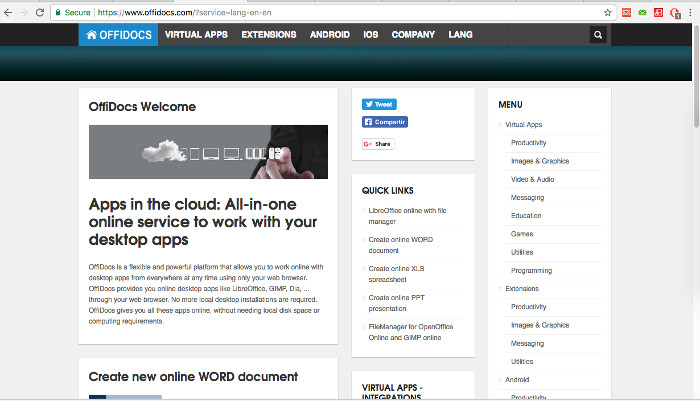
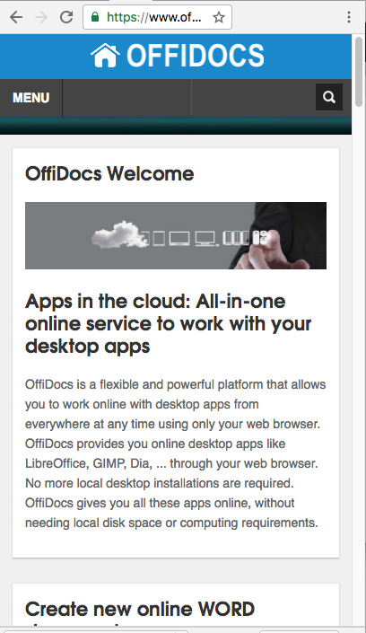
The Offidocs website has been enhanced with a new layout. It has now a Responsive web design so that its web pages can render well on a variety of devices and screen sizes..
The OffiDocs layout changes based on the size and capabilities of the device. For example, on a phone users sees our content and apps shown in a single column view; a tablet shows the same but in several columns.
The layout has changed but the the content and apps are the same. We do provide virtual linux applications like GIMP, OpenOffice, Inkscape. We do also provide Android, IOS, Extensions for Chrome and FireFox, integrations with several MarketPlaces, and a SDK for a quick integration with our web apps. The apps are categorized accorfing to the functionality offered.
The following pictures are screenshots of our new website layout:
For Desktop:

For phone:

See in http://www.offidocs.com
No comments:
Post a Comment